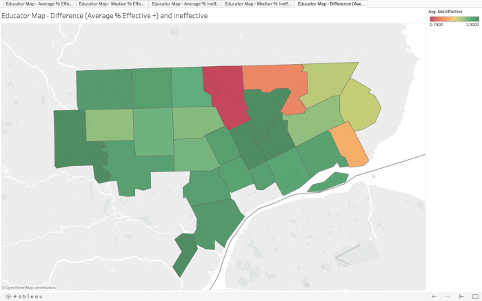
Data was presented as aggregated effectiveness rating percentages by school for the 2013-2014 school year. Title and summary information was cleaned away and I inserted a blank column for geographical data. Rather than taking time to research data mining in Google from Excel criteria, I just copied each school name and pasted them into Google one at a time, then copied the zip codes into the appropriate cell for each school. It took some time, but I wanted to have somewhat accurate geographical data to present for this problem.
I chose these four visualizations to explore the slight differences between average and median percent aggregation by Tableau. Based on the gradients available, I am satisfied with the results and am glad I took the time to include the zip codes.